
BRAND & CREATIVE STRATEGY
Credit Card Portfolio Launch
Five cards, one story. Financial services strategy that turned a tangle of products into a lineup members could actually navigate.
*Strategy and creative direction I led in a previous in-house role, before launching Strata Nova Studio.
Intro
A financial institution was relaunching its entire credit card lineup.
5 products, 5 audiences
…and nothing holding them together.
As lead creative strategist, I built the spine: connecting who each card was for, with how it should sound, and how it should show up across every channel.
The Problem
The cards had no shared strategy.
Fragmented messaging
Inconsistent visual language
Frontline teams were left explaining products off static sheets.
Members couldn't tell which card fit their life, because nothing was built to help them.
1. Personas
For this massive portfolio launch, one of our first projects was to create a distinct persona for each card to clarify who each product was for, bringing focus to messaging, imagery, and channel strategy across the portfolio.
These five personas allowed us to customize messaging and imagery to meet each audience where they’re at.

Rewards Card & the Everyday Optimizer
Persona summary
A busy spender who wants easy rewards on daily purchases without tracking categories or rules.
Imagery direction
Adult 25–50; in motion at the grocery store, coffee shop, gas station, checkout moments; warm, energetic lifestyle photography
Messaging & tone
Friendly, straightforward, efficient; “set it and forget it” energy

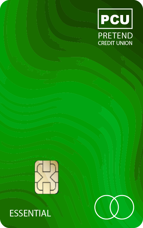
Essential Card & the Credit Builder
Persona summary
Someone actively building or rebuilding credit and looking for a reliable, supportive starting point.
Imagery direction
Adult 20–40; approachable, optimistic expressions; real-life moments: first apartment, budgeting on a phone, everyday errands
Messaging & tone
Encouraging, supportive, confidence-building, focus on progress and momentum, plainspoken, never condescending

Simply Card & the Rate Minimizer
Persona summary
A practical, budget-conscious member who wants to keep interest low and finances predictable.
Imagery direction
Adult 30–50; calm, neutral expressions; everyday settings: kitchen table, home office, paying bills, reviewing mail
Messaging & tone
Clear, reassuring, no-nonsense; emphasize simplicity, control, peace of mind; avoid hype or urgency

Lifestyle Card & the Experience Seeker
Persona summary
A member who prioritizes dining, travel, and experiences and wants their spending to feel rewarding.
Imagery direction
Adult 25–45; confident, expressive, aspirational but attainable; dining out, travel prep, concerts, city scenes
Messaging & tone
Energetic, aspirational, upbeat; focus on enjoyment and flexibility; polished but not flashy

Business Card & the Business Professional
Persona summary
A small business owner who wants straightforward rewards and clear separation between business and personal spending.
Imagery direction
Adult 30–60; professional but approachable; small business environments: storefronts, medical facilities, hands-on work
Messaging & tone
Confident, efficient, respectful of time; emphasize value, clarity, and control; practical over promotional
2. Creative Umbrella ☂
I also worked with our creative agency to build a creative framework that gave internal teams and agency partners a single source of truth: shared layouts, color-led differentiation, and visual motifs that signaled "fit" at a glance.
The Umbrella enabled
Clear roles and positioning for each card
Consistent design and voice across channels
Faster alignment across teams and partners
How it worked
Shared layouts and hierarchy across materials
Color-led differentiation for quick recognition
Visual motifs reinforcing continuity and “fit”
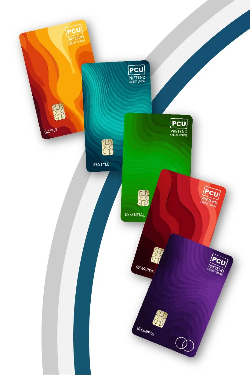
Card Designs
Five cards designed within a shared visual system—balancing differentiation, brand integrity, and stakeholder expectations at portfolio scale.


3. Assets & Deliverables
This launch required a wide range of channel-ready assets. A selection of key deliverables is highlighted below:
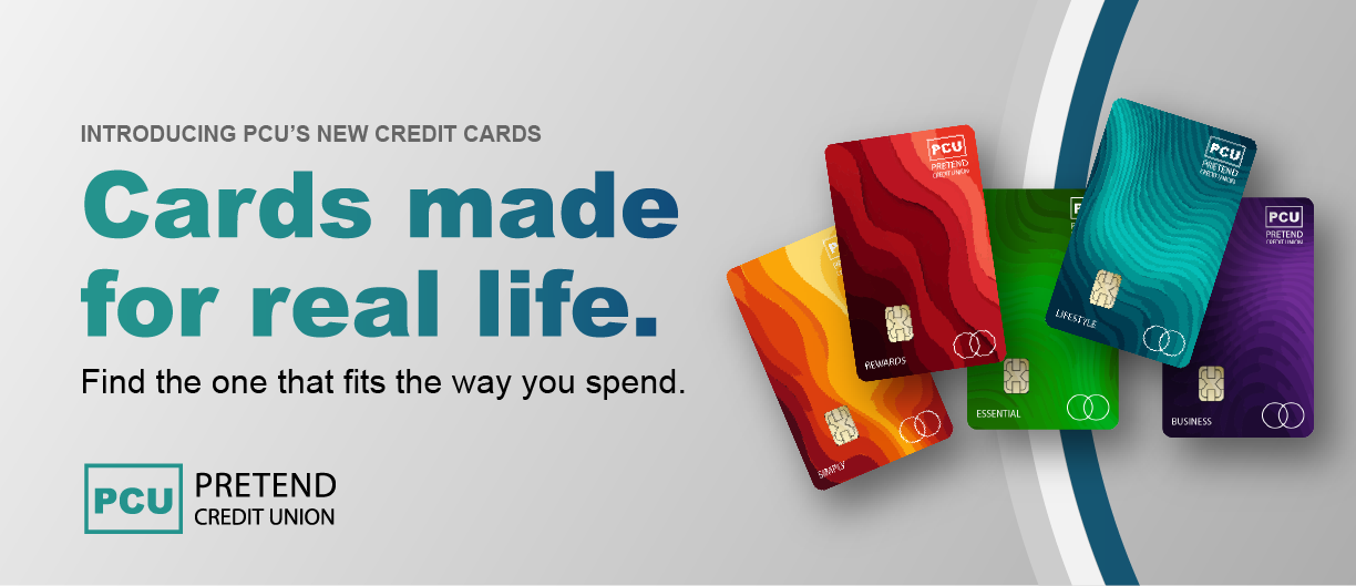
Web: “Hub” Landing Page
Emails: Three Examples
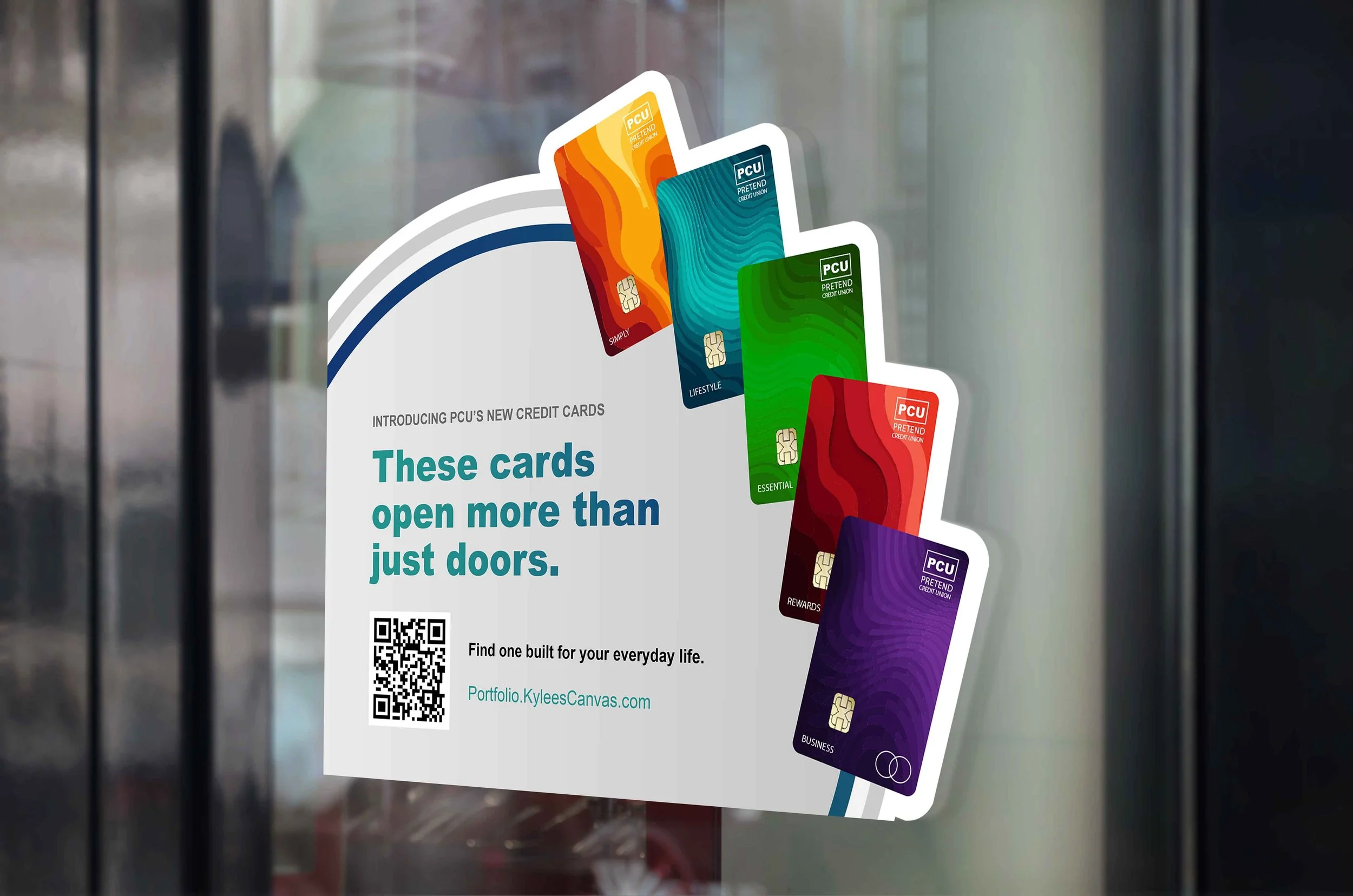
Small Flyer/Handout
Window/Door Decals
Teller Guide
“Hub” Landing Page
The primary landing experience for the credit card portfolio, designed to help members quickly understand their options and find the card that fits their life.
This example recreates the structure, messaging approach, and visual hierarchy used in the live experience to demonstrate my role in shaping the portfolio’s digital foundation.

Three Emails


Handout, Window Decals, Teller Guide


4. Results
While quantitative results were still emerging, this launch delivered meaningful structural and experience improvements across members, teams, and partners.
Unified Portfolio Launch
One cohesive credit card system across digital, branch, and email
✓
Clear Creative Framework
Defined personas, positioning, and visual language for all five cards
✓
Faster Cross-Team Execution
Shared guardrails reduced rework and decision fatigue
✓
Improved Member Clarity
More intuitive card selection and onboarding experience