
LOGO DESIGN
Savage Sounds
A brand built to be heard.
The Brand / The Challenge
Savage Sounds designs specialty speakers for people who take audio seriously. The brand needed a mark with real presence. Something that could carry the energy of the product without falling into the clichés the audio world is full of: generic soundwaves, stock speaker icons, and empty "bold" aesthetics.
The challenge was finding a symbol with real meaning. A mark that felt powerful, personal, and unmistakably Savage Sounds.
Style Exploration
Three roads, one brand. We sketched each direction far enough to feel the difference, then asked which one sounded most like Savage Sounds.
Sound Grenade
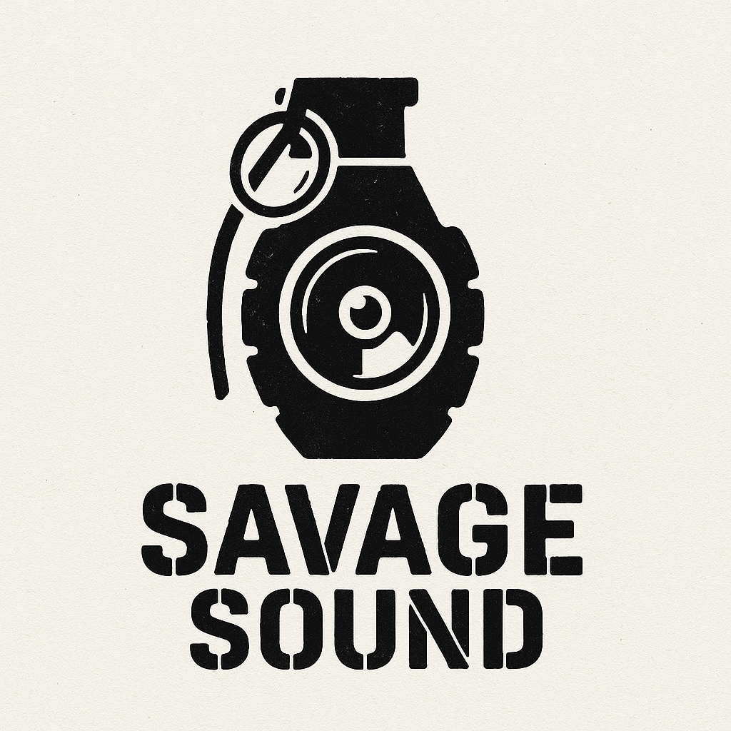
Explosive | Tactical | Militant | Rugged
Savage Skull

Edgy | Rebellious | Punk | Loud
Sound of a Lion

Regal | Strong | Fierce | Bold
The Winner
The lion took the crown. It carried a weight the other concepts couldn't touch: the quiet confidence of something that doesn't have to prove itself. Where the grenade leaned loud and the skull leaned edgy, the lion just was. Powerful by default.

The Final Logo & Variations
A roar rendered in color. The final Savage Sounds logo layers a bold wordmark with a lion that carries the brand's full presence, built to work across packaging, product, and everything in between.
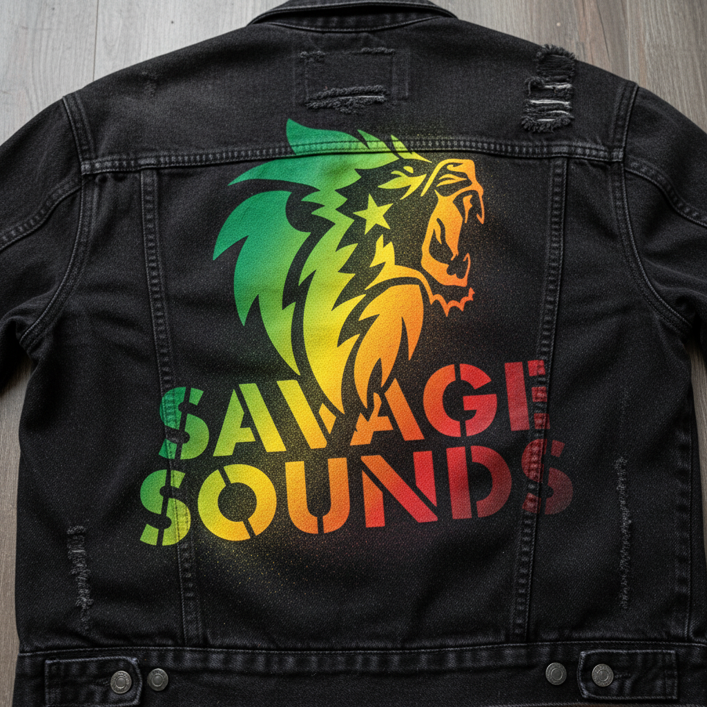
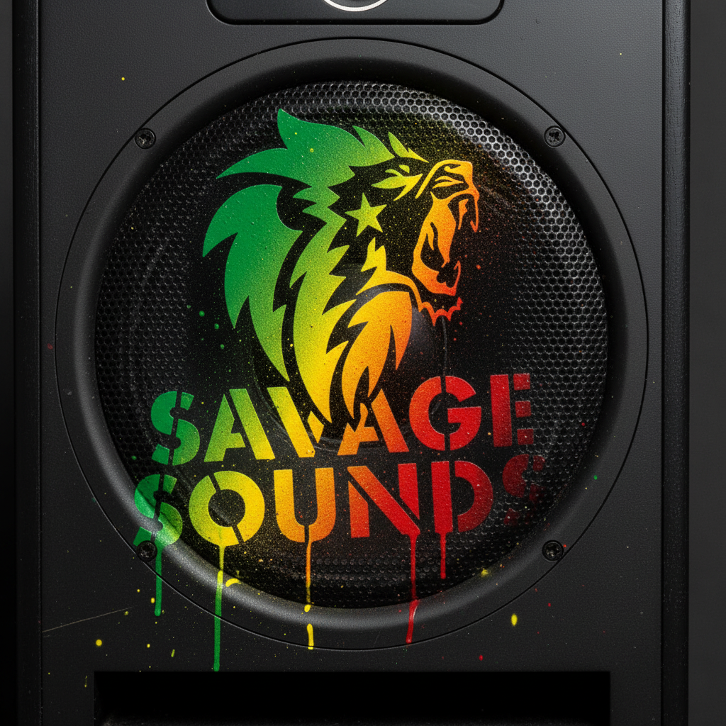
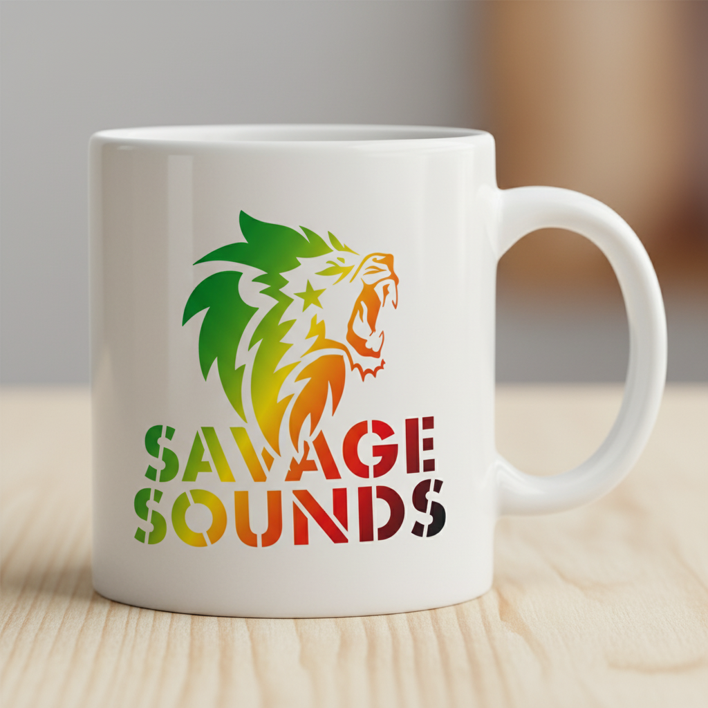
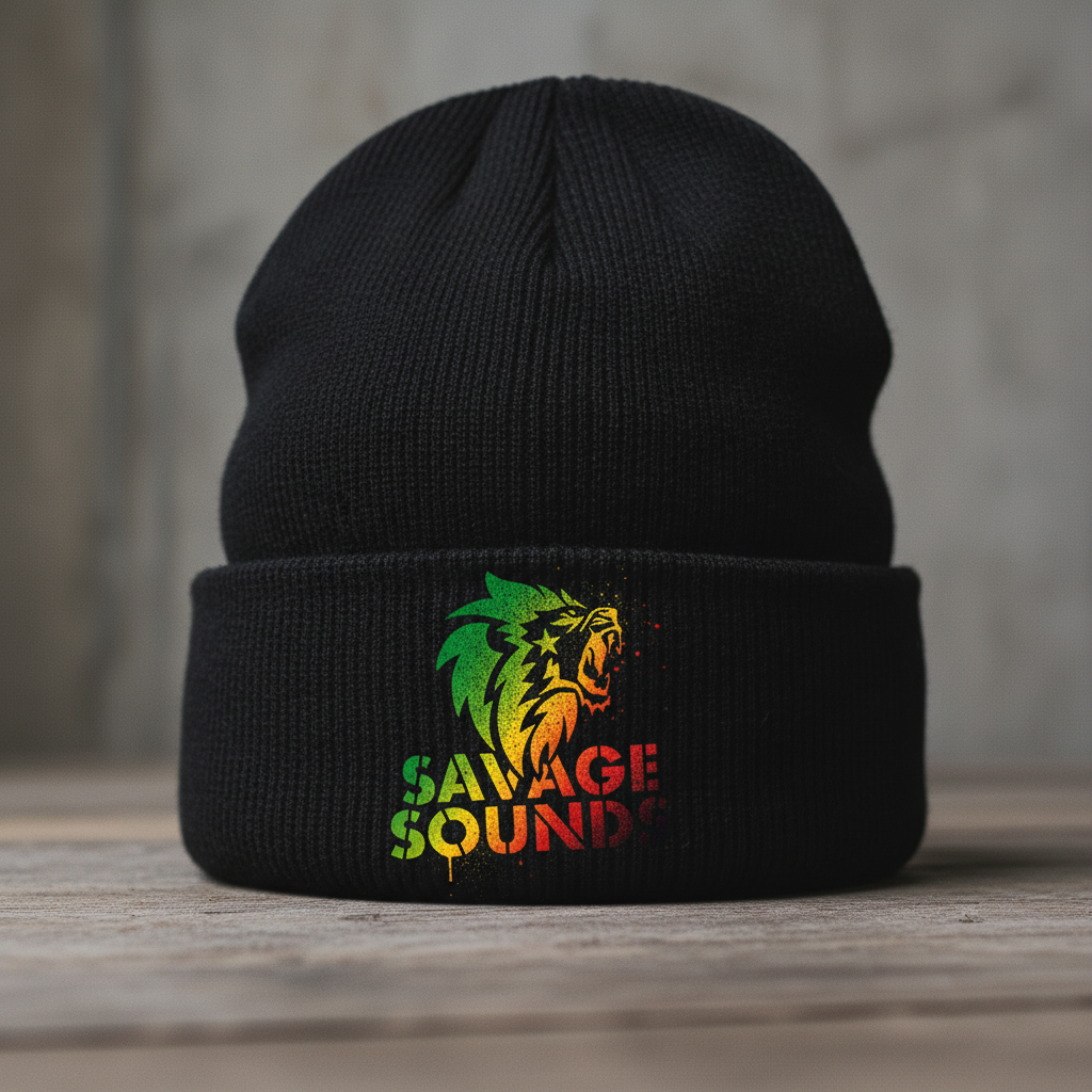
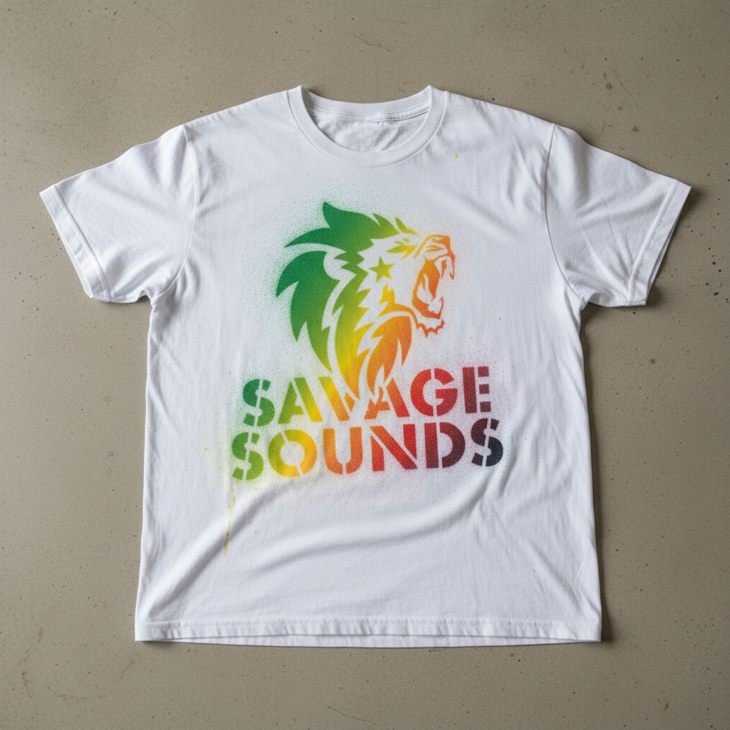
In the Wild
Savage Sounds shows up on the gear it belongs on, wrapping the brand around the products that carry the sound.
Looking Back
The brief asked for presence. Something bolder than a soundwave and deeper than a speaker icon. The lion delivered on both. It's a mark that doesn't chase attention, it commands it, and that's exactly what Savage Sounds needed.