
LOGO DESIGN
Tame Dog
Serious protection. Playful soul. A brand that had to be both.

Tame Dog protects treasured trading card games from damage and everyday wear and tear. Their flagship product is protective card covers that serious collectors and everyday players depend on to keep their cards in perfect condition.
The brand needed to communicate that reliability. But at the heart of the company is Leia, a real dog with a real personality, and leaning into that warmth was always part of the plan. The challenge was finding the line between trustworthy and fun without tipping too far in either direction.
Style Exploration
Before a single design file, we explored three distinct concept directions. Each sketch highlights a unique strategic style that represented key elements of the Tame Dog brand.
Art Deco
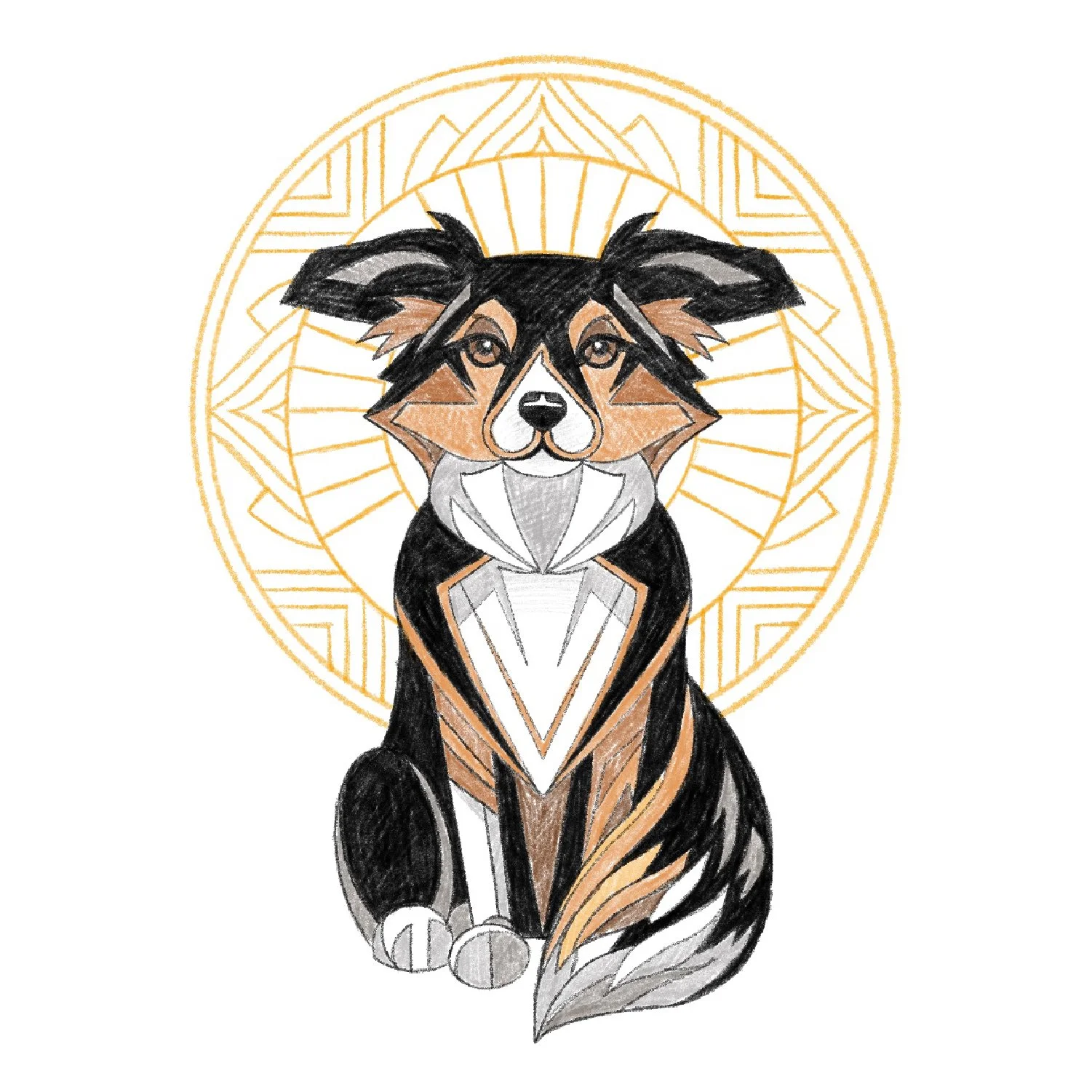
Guardian | Protector | Regal | Classic
Art Nouveau
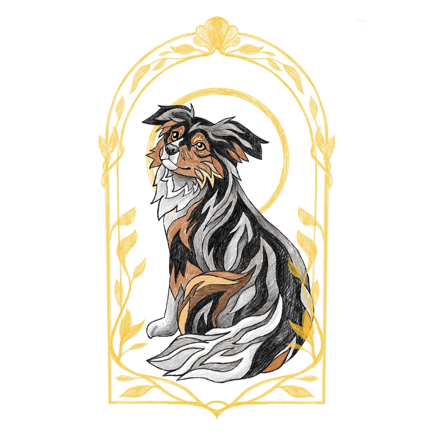
Soulful | Organic | Elegant | Friendly
Synthwave
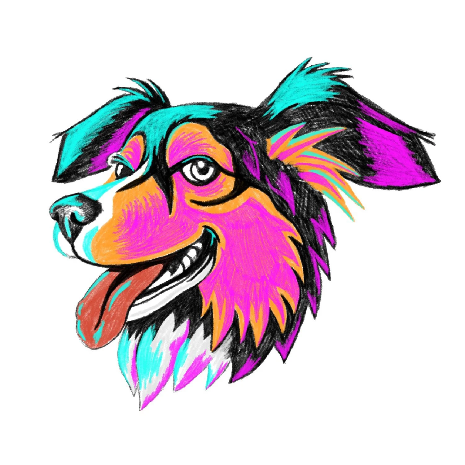
Bold | Vibrant | Playful | Rebellious
The Winner
Art Nouveau captured Leia best. She's the clients’ treasured companion and the heart of the brand. The approachable warmth of the Nouveau direction felt like her, and that's the thread we carried forward.
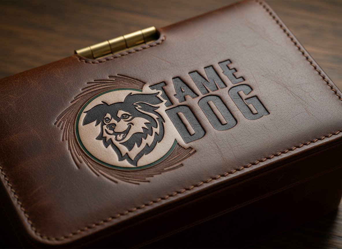
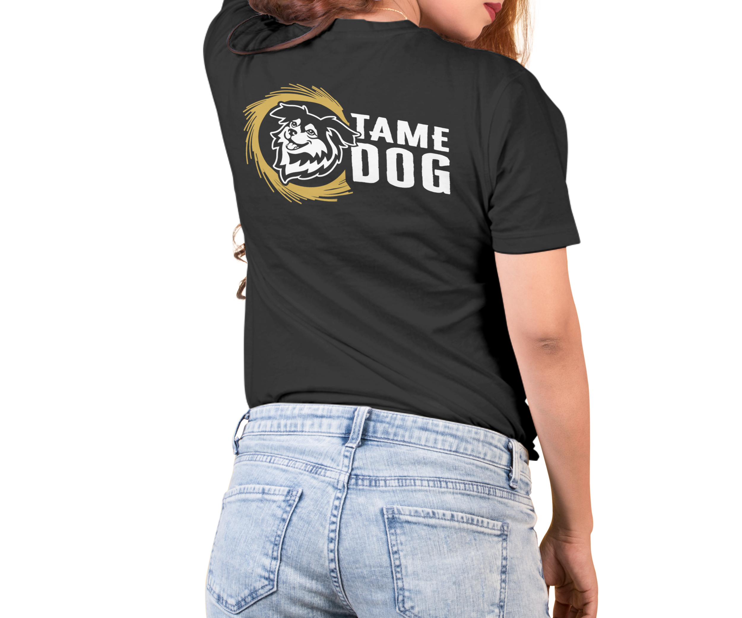
The Final Logo
From sketch to system. The final Tame Dog logo holds both sides of the brand: the trustworthy protector collectors can rely on, and the soulful companion at the heart of the company.


Simplified Versions, Shapes, & Ideas We Explored


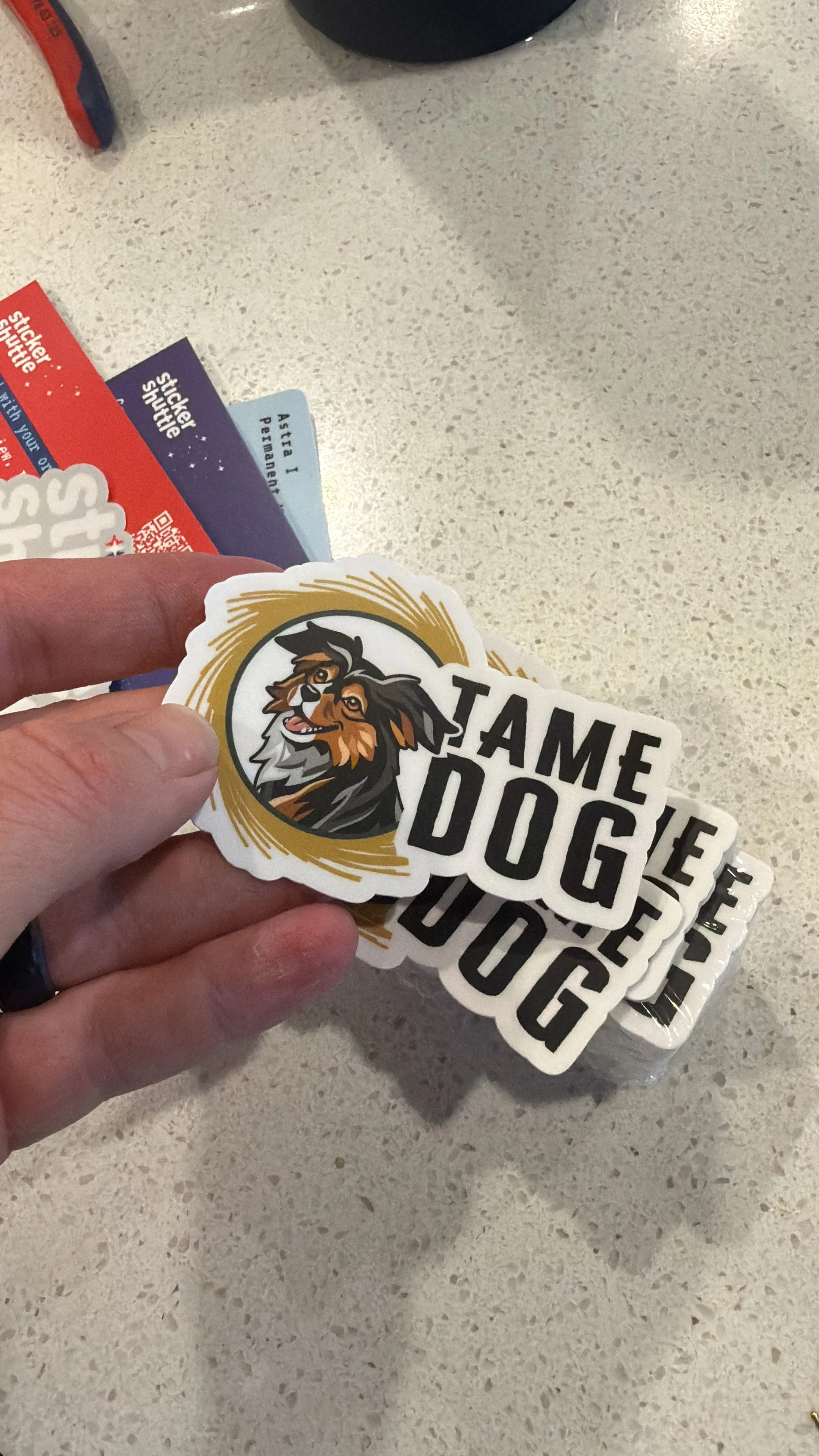
In the Wild
Brands come alive when they meet merch and swag.

Looking Back
The brand needed to feel trustworthy without feeling cold, and playful without feeling unserious. Leia made that possible. She's the reason the mark has soul, and she's the reason it works.
"Working with Kylee was so fun and easy, she was able to expand on our own ideas beautifully and gave us a logo with a short turnaround time that we loved. We especially appreciated how organized the final files were; she had them already organized for social media, printing, websites etc. We have already worked with her twice and plan on completing more projects with her."
— TAME DOG